Friday, 8 September 2017

3 point lighting

Key Light

This is the main light. It is usually the strongest and has the most light on the look of the scene. It is placed to one side of the person so that this side is well lit and the other side has some shadow.

Fill Light

This is the secondary light and is placed on the opposite side of the key light. It is used to fill the shadows created by the key. The fill will usually be softer and less bright than the key.

Back Light

The back light is placed behind the subject and lights it from the rear. Rather than providing direct lighting like the key and fill, its purpose is to provide definition and subtle highlights around the subject's outlines. This helps separate the subject from the background and provide a three-dimensional look.

Friday, 30 June 2017

Nadav kander photo analyse

Image result for nadav kander photographerI like this photo because it has no real background and that stands out because all the other photos are in a studio back ground as well as the model being in casual clothes. the model is probably  having a conversation with the person without the camera. This could be set up this way by the studio to stand out or this could be a lucky. I also like how random the props are played out and this shows how nadav kander works.
there were many materials used in this photo e.g. the tripod the wires and the clothes. The techniques are that the photographer is making him look away so it looks more natural. This photo was probably taken in his studio this was ether accidental or staged so if it was staged about 2 hours because setting up the studio would take 30 minutes and then the camera angle then getting the model dressed would take 10 minute's then getting the perfect shot as well as taking about 50 shots to get the perfect one would take up the rest of the time.yeah I just need some wires and a woolly jacket a tripod and some spare clothes and a jacket. I think that you just need the props and the scene. I think the artist is using his memory because this looks like his background of his studio so he switched it up.Image result for nadav kander photo analysis This is the final piece and it doesn't have the same background the back ground is a white  background reflecting the light. He is standing up but in the other photo he is sitting in a chair also the jumper and clothes have gone. This photo has 3  point lighting because there is no shadow under his chin as well as having a light on his hair. The pose of the photo is very simple but stands out because its simple.the main feature is the way that the actor is facing.the colors are not very bright but the jacket is a bright grey.
this photo has either a projector or it has been photo shopped to look that way with the trees coming out of his face and to the side of him.the pose is the exactly the same as the one above this one the artist (Nadav kander) would of created this in his studio and probably took photos of the trees near or around where he lives.the background is black to make it look more creepy when the tree and woods gets implemented into the photo.the colors are very dull and gloomy , his top is grey which is a dark color.the blue color from the trees and forest stand out the most.  

Wednesday, 14 June 2017

Nadav kander

Born in Israel, 1961 Nadav Kander, in 1963 his family moved to South Africa and settled there he first used a He Pentax camera in 1974. He was later drafted into the South African Army, he worked the army in a dark room printing aerial photos. In 1986, Nadav Kander moved to London with his wife, Nicole. His photography work, which has been celebrated worldwide. In 2001 Nadav kinder published a monograph called Beauty's Nothing this was followed by a cataloger entitled Nadav Kander - Night, which contained nocturnal landscapes that accompanied his exhibitions in the Shine Gallery, London, and at the Yancey Richardson Gallery in New York. In 2009 because of his photo of barrack Obama as well as getting into the New York Times magazine.

Tuesday, 6 June 2017

my 5 photos

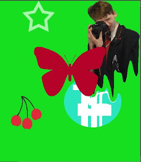
I liquefied the photographer and the circle I also added a bunch of cherry's 
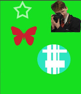
this photo has added a circle that I cropped out a of a new back ground and use a use white rectangles
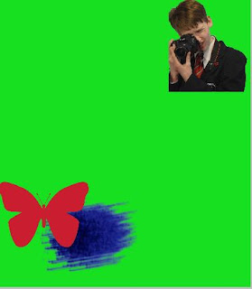
I like this photo because the camera is looking at the butterfly as well as the shape. 
save images 5 times flattened and jpeged
analyse final image
send final for miss 4th  July

best way to analyse

 best way to analyse  

1 genre type
2 light /natural/ artificial /harsh /soft /exaggerated
3 science
4 unique /start blank
5 framing /focus
6 formal elements colour/ composition / tone/ shape
7 accident!
8 meaning
9 ideology/power
10 warp meanings symbols

Thursday, 11 May 2017

binary opposition

binary opposition means is when a pair of related terms or concepts that are opposite in meaning there is always the complete opposite. without binary opppasition the world would be unbalanced.